08 / Interactive explainer
UX vs UI.
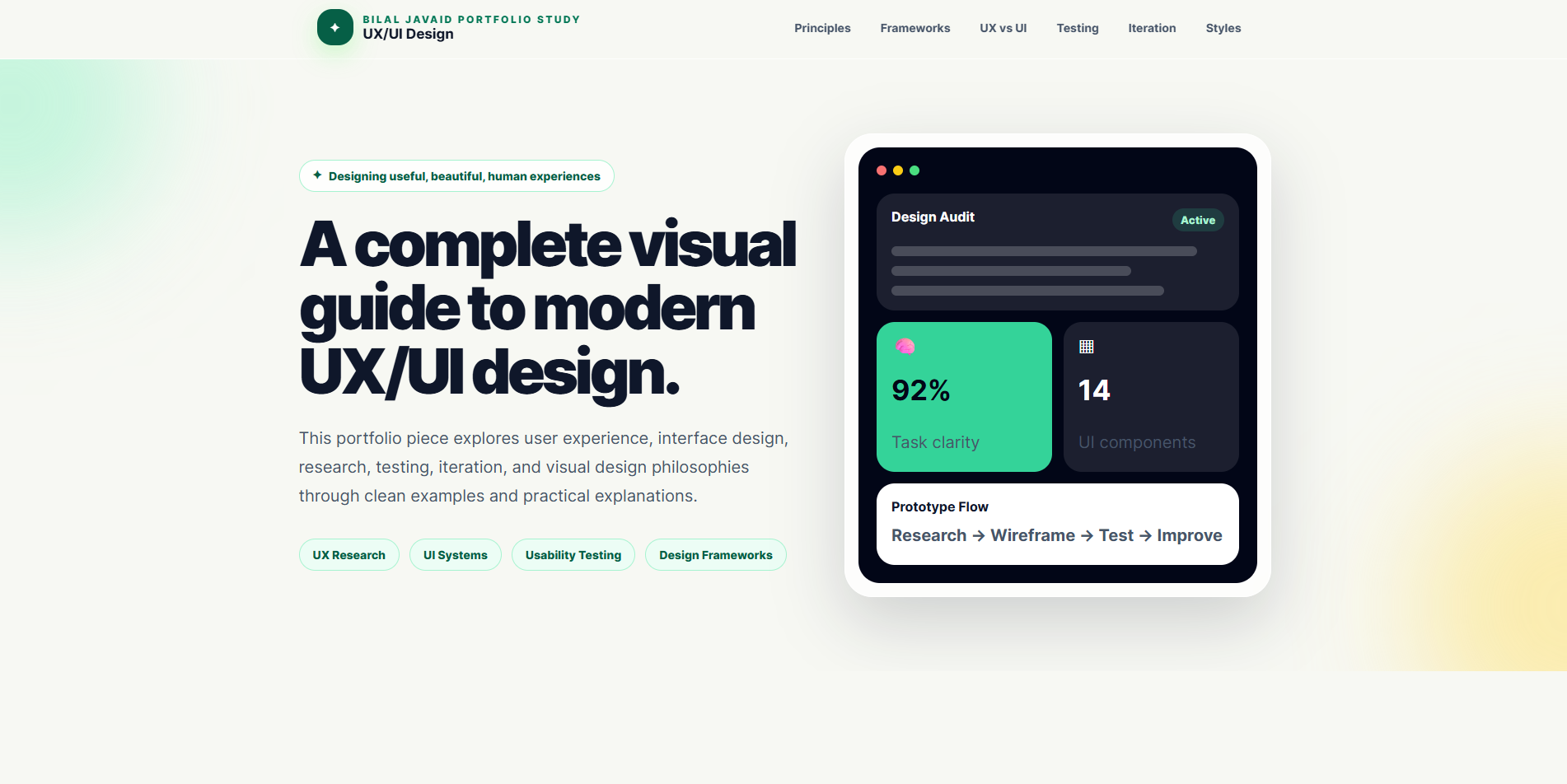
Clients, stakeholders, and even new teammates often use “UX” and “UI” as if they meant the same thing. I designed and built uxvsuidesign.com to make the difference, and the overlap, easy to see. It connects research, flows, usability testing, iteration, and visual systems in one guided, interactive experience.
- Role
- Content strategy, interface design, and front-end development
- Format
- Self-initiated interactive website · Published
- Methods & tools
- HTML · CSS · JavaScript · Interactive components
A slogan isn’t an explanation.
UX and UI usually get reduced to a one-liner or a ketchup-bottle meme. That’s catchy, but it doesn’t help anyone make better decisions about a product. When people don’t understand the difference, “make it look better” gets mistaken for fixing a flow, and a broken flow gets a new coat of paint.
I expanded the idea into a study people can browse: how a product is understood, how it works, and how its visual layer helps people act. The site covers user-centred principles, design frameworks, the UX/UI split, testing, iteration, and visual styles including skeuomorphism, neumorphism, and glassmorphism.
How I shaped it.
-
01 / Structure the learning path
I ordered the content so each idea builds on the last: principles and frameworks first, then the UX/UI comparison, then testing, iteration, and visual styles.
-
02 / Turn theory into interaction
I replaced one long essay with section navigation and selectable examples, so visitors inspect a concept instead of just reading about it.
-
03 / Design and build together
I built it with HTML for structure, CSS for the responsive visual system, and JavaScript for the interactive examples and navigation. Designing and building in parallel let me adjust interactions as soon as they felt wrong.
-
04 / Show the relationship
I kept accessibility, content clarity, and feedback states visible in both disciplines, because a polished interface can’t rescue a confusing flow.
Where I drew the lines.
Show the overlap
I resisted a clean “UX here, UI there” split. The two have different emphases, but both shape the final interaction, and the site shows where they meet.
Progressive depth
A stakeholder can scan the main sections in a few minutes. A student or designer can go deeper into individual frameworks and design styles.
Make concepts tangible
Terms like “iteration” and “hierarchy” are abstract until you see them. I paired each one with an example visitors can inspect.
Same product. Two lenses.
UX / How does it work?
Is the path to the goal clear? Can someone recover from a mistake? Does the information appear when it is needed?
UI / How does it feel and respond?
Do type, spacing, contrast, focus, and feedback help someone read, decide, and act?
Open each lens to see the questions I built the site around. I ask the same two questions of every product I work on.
Let the learning path demonstrate the subject.
The content moves from principles to the UX/UI distinction, then to methods, testing, iteration, and visual styles. I used section links and selectable examples to turn a long article into an explanation people can navigate, so the site demonstrates good UX while it explains it.
User journey / information architecture
- Enter through the central UX/UI question
- Choose a topic in the section navigation
- Interact with an example
- Connect its visual treatment to the user journey
From content map to build
I started from the content map, since the order of ideas was the core design problem. Then I built the interactions directly in the browser. The published site is both the high-fidelity prototype and the finished product.
Palette and intent
#0F172A
Creates an editorial frame and strong type hierarchy.
#F6F4EF
Provides a calmer long-reading surface.
#065F46
Marks interaction and the conceptual contrast between lenses.
I taught the distinction through content and interaction. Colour supports sections and calls to action, but it’s never the only explanation.
How it comes together.
I built the project as a static HTML, CSS, and JavaScript website with responsive navigation and interactive explanatory components. It’s lightweight, needs no framework, and works well on phones, which matters for a resource people often open from a shared link.
What this work taught me.
The clearest way to explain design is to let the page demonstrate it: useful structure, clear labels, and feedback at the point of interaction. The same skill helps me explain design decisions to clients and stakeholders.