09 / Dealership website
Vancouver
Pre-Owned.
Vancouver Pre-Owned hired me to design and build its dealership website. The site has several jobs at once: help someone find a vehicle, make financing feel approachable, and connect them with a person when they’re ready. I designed it around a clear route into each of those journeys.
- Role
- Website design & development
- Engagement
- Paid client project · Published dealership website
- Focus
- Inventory discovery · Financing path · Contact
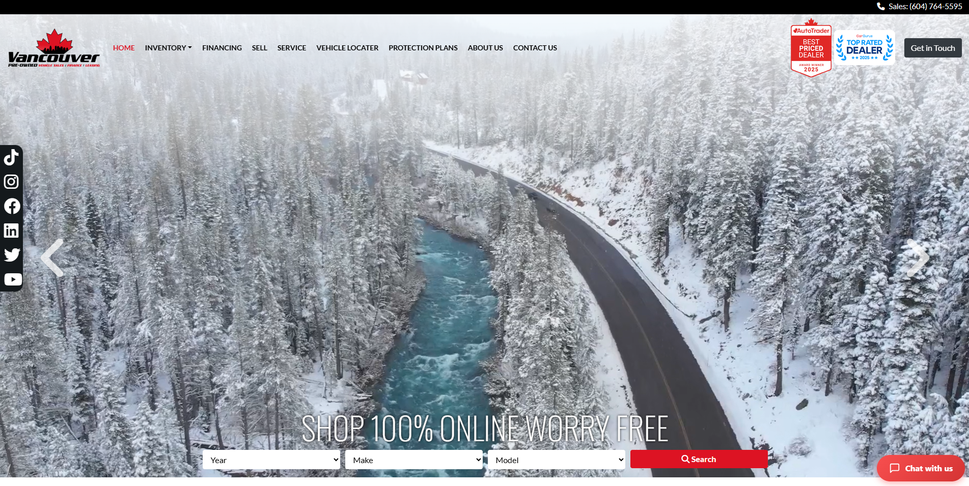
Give different buyers a starting point.
Used-car shoppers don’t all arrive with the same intent. Some know the exact make and model they want. Some only have a budget. Others need to know whether they can get financing before they look at a single car. If the site assumes everyone is the first type of shopper, it loses the other two.
So I designed for all three entry points. The homepage puts a year, make, and model search in the first view for shoppers who know what they want. The navigation makes inventory, financing, selling, service, the vehicle locator, protection plans, and contact separate, clearly named destinations for everyone else.
From browsing to a conversation.
-
01 / Begin with inventory
A shopper can start with year, make, and model or just browse the stock. I placed the search over the hero image, so the next action is available the moment the page loads.
-
02 / Compare the details
Each inventory entry shows the key vehicle information and the price up front, then offers routes to view details, confirm availability, or explore financing. Every listing is a possible next step, not a dead end.
-
03 / Make financing approachable
A long credit application puts people off, so the financing experience breaks it into a series of short questions about preferences, budget, trade-in, and customer details. Each step feels small.
-
04 / Keep contact close
Buying a car is a high-trust purchase. A sales number that stays visible and a prominent Get in Touch action give visitors a way to reach a person whenever they’d rather talk than fill in another form.
A local first impression with a practical next step.
Place first
I chose a winter road scene to tie the first screen to northern British Columbia. It gives the dealership a sense of place that stock showroom photos can’t.
Action in red
I kept the interface mostly black, white, and photographic, so red only marks the search and contact moments and stands out wherever it appears.
Two levels of intent
Broad navigation supports people who are still exploring. Direct inventory and financing actions support shoppers who are ready to move forward.
Two routes: a car in mind or a question first.
I mapped the site as two routes that meet at the sales team. One is for shoppers who already have a car in mind. The other is for shoppers whose first question is about budget or financing. Both routes stay short and always offer a way to reach a person.
User journey / information architecture
- Search by year, make, and model or browse stock
- Review vehicle detail and price
- Check availability or explore financing
- Contact the sales team
Palette and intent
#171717
Anchors navigation and makes vehicle imagery prominent.
#FFFFFF
Provides room for inventory details and forms.
#dd1323
Makes search and contact routes visible over the largely neutral UI.
Photographic atmosphere sets a local tone, but search fields and price information must remain easy to read and operate over changing imagery.
Keep the route usable.
Car shoppers browse on phones as well as desktops, so the essentials have to hold up on every screen. I paid most attention to the parts shoppers touch most: labelled search fields, keyboard access through inventory navigation, readable text over changing photography, and form errors that explain what to fix.
If I returned to the project, my next step would be a full accessibility pass across devices, especially the multi-step financing form, where one unclear error can cost a lead.
What this project taught me.
Atmosphere earns attention, but structure turns it into leads. A dealership homepage works when the search, financing, and contact paths give every kind of shopper something to do next.