07 / Interactive study
Light mode / Dark mode.
Choosing a theme changes much more than the background colour. I researched, designed, and built lightdark.ca, an interactive site where visitors can compare the two modes, read the trade-offs, and switch real interface examples for themselves instead of taking a single blanket claim on trust.
- Role
- UX research, interface design, front-end development
- Format
- Self-initiated interactive website · Published
- Methods & tools
- HTML · CSS · JavaScript · Responsive design · Accessibility
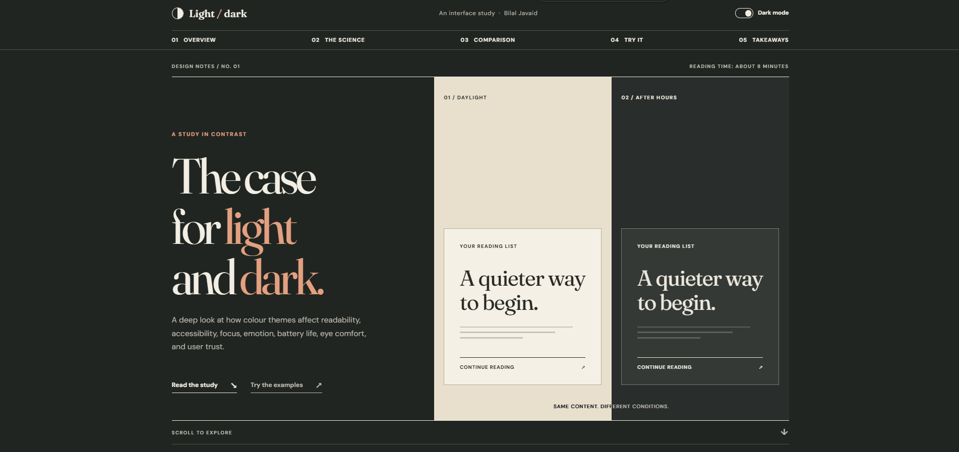
“Which is better?” is the wrong question.
Dark mode is often treated as a feature to switch on, or as a matter of taste. In practice, whether an interface should be light or dark depends on the task, the ambient light, the device, and the person using it. A long article, a data dashboard, and a form each respond differently to the same theme.
I wanted to make that argument by letting people see it rather than just telling them. So I built the explanation and the evidence into the same page. Visitors can change the whole site’s theme, or switch three smaller product examples independently, and compare the results side by side.
How I built the argument.
-
01 / Frame the comparison
I organized the research around four factors that actually change the answer: the user’s setting, the reading task, visual sensitivity, and device conditions.
-
02 / Build paired examples
I showed identical content under both themes, so differences in hierarchy, labels, and contrast come from the theme alone and not from a different layout.
-
03 / Put the choice in the user’s hands
I added a site-wide theme control plus separate switches for the reading, dashboard, and form examples, so a visitor can test one context without losing their preferred theme.
-
04 / Refine the presentation
Once the interaction worked, I redesigned the page with an editorial visual system: measured typography, warm neutrals, open comparison rows, and restrained motion.
Decisions I made along the way.
No universal winner
I deliberately avoided declaring a winner. The site presents situations and trade-offs, because treating a preference as a design rule is exactly the mistake I wanted to challenge.
Independent demos
Each example switches on its own, so a visitor can compare contexts without overriding the site theme they chose.
Respect the user
The page follows the system preference at first, remembers a manual choice, and honours reduced-motion settings. The site practises what it argues.
Prototype the comparison in the browser.
I structured the site to move from context and trade-offs to paired examples. A visitor can switch the whole site or an individual sample, which makes comparing the two themes the core of the experience.
User journey / information architecture
- Read the theme question
- Compare identical content in light and dark
- Switch an individual example
- Choose a site preference and revisit
Designing in the browser
I designed this one directly in HTML, CSS, and JavaScript. For a project about how themes behave on real screens, a static mock-up couldn’t answer the questions that mattered: how contrast holds up, how states change, and how a stored preference feels on the next visit. The live site is the design and the prototype at once.
Palette and intent
#F2EEE5
A softer reading surface for the light presentation.
#212522
A dark surface that preserves text hierarchy.
#A1462E
Keeps links and controls recognizable across both modes.
I checked contrast and states separately in each mode. Inverting the background alone would have left borders, muted text, and focus feedback unresolved.
How it comes together.
I built it as a static site with semantic HTML, CSS custom properties, and JavaScript. Every colour is a token, so each theme is a complete, deliberate set of values, not a filter over the other. Local storage remembers a manual theme choice. Native buttons expose their state to assistive technology, and responsive layouts keep the side-by-side comparisons usable on smaller screens.
What this work taught me.
A dark theme isn’t a colour swap. It’s a second design task. The goal isn’t to pick the right mode, but to make both modes readable and give people control over which one they use.