04 / Product concept
FocusNest.
FocusNest is a productivity app concept for young adults. It brings coursework, commitments, and everyday tasks into one place. In a team of three, I led the UI design and shaped how capturing a task, seeing it in time, and choosing what to focus on next connect in the Figma design.
- Role
- UI design lead · Interface, visual system, and screen design
- Team
- Three-person team
- Format
- Product pitch and high-fidelity interface concept
- Methods & tools
- Figma · Information architecture · Mobile UI · High-fidelity screens
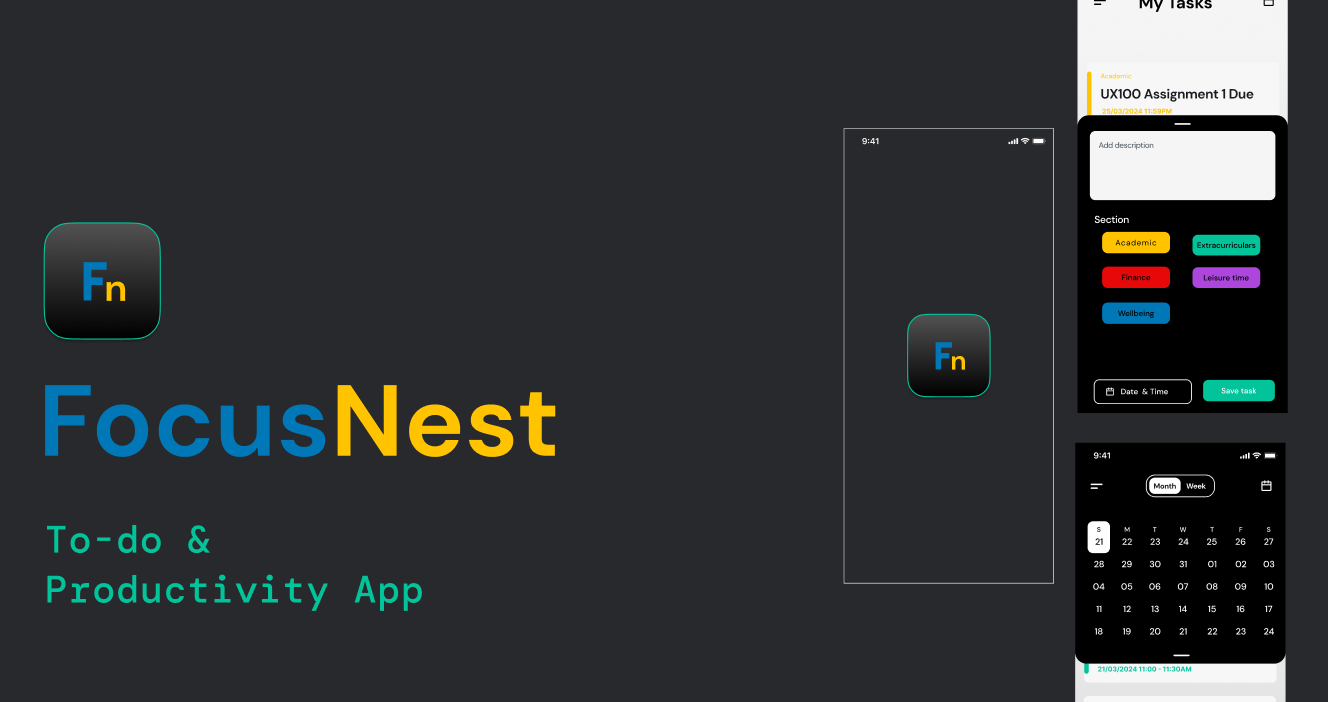
A planner for the whole day.
Coursework is only one part of a young adult’s schedule. Classes, part-time work, clubs, money, health, and personal plans all compete for the same week, but most tools only handle one of them. So people end up juggling a school planner, a calendar, a notes app, and their memory.
FocusNest is an app concept that brings academic, extracurricular, finance, wellbeing, and personal commitments into one planning space. I decided how the app looks, how its screens connect, and how the design keeps very different kinds of tasks readable in one list.
UI design lead. I owned the screen designs, the visual system (type, colour, category treatment, and the Fn identity), and the high-fidelity Figma screens and presentation boards.
The three of us shaped the concept and pitch together. My design decisions are the ones described on this page.
One journey, four clear moves.
I designed the product around a simple information architecture. A mixed task list is the home base, categories give context, a calendar shows time, and focus and analytics tools cover what happens after planning. Every screen belongs to one of four moves, which kept the app from becoming a pile of features.
-
01
See
Scan upcoming tasks and their written category labels.
-
02
Capture
Add a description, section, and date in a contextual sheet.
-
03
Place
Switch between month and week views to understand time.
-
04
Focus
Open the timer or review activity from the wider menu.
The central task journey.
These three states from my Figma board tell the story better than the whole board at once. Choose a step to see the screen, the interaction, and the reasoning behind it.
Let the next task come into focus.
Names and dates do the primary reading work. Small category names and coloured rails make very different commitments easier to distinguish in one list.
- The page title orients the user before the content.
- The add control stays within reach after scanning.
- Colour repeats with text, so it is not the only category signal.
Capture without losing the list.
The sheet appears over the task screen. Description comes first, then category and scheduling; the person can keep the context of what they were reviewing.
- Section buttons make the content model visible.
- Date and time are a separate deliberate step.
- Save task concludes the flow with an explicit action.
Change the view, keep the context.
The calendar reveals how a task fits into the week or month. It is a second view of the same commitments, not a separate planning system.
- The month/week control states the available scale.
- Tasks remain present below the calendar.
- Dates link capture to planning.
Explore the file behind the screens.
This walkthrough covers the core task journey. Open our Figma Community file to explore every screen and board.
Build a path into the product.
I gave new and returning users separate routes from the entry screens. Inside the app, one menu holds search, analytics, the Pomodoro timer, settings, and category views. The design question I kept asking was where each destination belongs: what deserves a place on the main screen, and what can wait one tap away.
One primary action per screen.
I kept the sign-in view dark and quiet so the account decision stays small. In a built version, form fields, recovery, and account creation would each need clear labels and visible keyboard focus.
See entry board ↗Group the deeper tools.
I kept task capture central and moved secondary tools into the menu. Each category has a written name as well as a colour, so it means the same thing on a task card as in a filtered view.
Planning leads to doing.
Planning only matters if it leads to doing. I put the focus timer next to the schedule, so starting a work session follows directly from seeing what’s next. The analytics and profile screens close the loop by letting someone look back at how their time went. The numbers on these screens are sample data I designed to show the layout.
Bright signals on a calm base.
I built the visual system around DM Sans, the “Fn” mark, and a blue and yellow wordmark. Every colour has a job: charcoal for the entry and dark surfaces, blue for primary actions, yellow for brand energy, and secondary colours for task categories.
#24282C
Anchors entry and dark surfaces.
#087AB8
Directs attention to primary actions.
#FFBF00
Gives the identity warmth and flags Academic tasks.
#00BFA5
Distinguishes extracurricular tasks.
The board also uses red, purple, and other category colours. My rule was that each category colour always appears with its written name, so the meaning holds in the list, the menu, and the calendar. In a production build, I’d contrast-test each colour against both themes.
Open visual-system board ↗What I’d do next.
FocusNest ended as a pitch with high-fidelity Figma screens and presentation boards. It wasn’t built or tested with users. Looking back with more experience, here’s how I’d move it forward.
-
01 / Link the core loop
Build a clickable prototype that connects signing in, adding a task, scheduling it, and starting a focus session. That loop is the product.
-
02 / Test the category model
Run task-based sessions with students to see whether the categories match how they actually think about their week, or whether they need to create their own.
-
03 / Check the labels and controls
Watch where people hesitate in the add-task sheet and the menu. Those moments would show which labels need rewriting.
-
04 / Accessibility before build
Review keyboard operation, screen-reader labels, focus order, text scaling, and contrast in both themes before a single screen goes to development.
What the concept is trying to earn.
A planning tool becomes useful when someone can capture a commitment and then decide where their attention should go next.